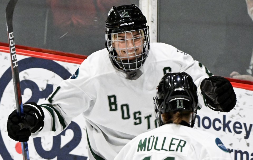
Hockey star Hilary Knight wouldn’t expect anything less.
More than a year after the circuit was founded, the Professional Women’s Hockey League unveiled much-anticipated names and logos for all six franchises on Monday.
Many fans took to social media to share their love for the new looks, but others weren’t so sure.
"It's tough,” said Knight, captain of the Boston Fleet. “Whenever you launch something, people are like, 'Oh, I don't know if I like it,' right? There's always sort of a mixed bag of reactions.
“But I think people are really attached to this.”
The Boston Fleet, Minnesota Frost, Montréal Victoire, New York Sirens, Ottawa Charge and Toronto Sceptres will take the ice as the league enters its second season.
During the inaugural campaign, teams played without nicknames, with only city names stitched across each team’s jerseys.
The Montreal Victoire’s logo — featuring a winged figure, a hidden “M” and the Fleur-de-lis — received some rave reviews.
“The amount that Montreal's branding clears everybody else here is simply incredible,” said hockey YouTuber Nathan Murdock, known as “Grav,” on X.
The Toronto Sceptres’ combination of gold “T” and “S” initials appeared to be an Easter egg for Taylor Swift fans. Several “Swifties” noticed a suspicious resemblance to the global pop star wearing a similarly branded cheerleader outfit in the music video for “Shake It Off.”
Meanwhile, people questioned the originality of Ottawa’s logo. The Charge emblem — a red “O” that could also be a “C” with spikes trailing its side — drew comparisons to the NHL’s Calgary Flames.
“I’ll say this: I like Montreal and New York’s logos a lot, and Toronto’s is fine,” posted Scott Wheeler, a writer at The Athletic.
“The other three … not so much. Feel for the great fans in Ottawa in particular because the Charge and its logo is, and I’m trying to be gentle, woof.”
The Boston Fleet's green “B” shaped like an anchor resembled the logo of the Hartford Whalers, the NHL team that folded in 1997, only turned 90 degrees.
PWHL senior vice president of business operations Amy Scheer knew there would be some backlash after the announcement Monday, but took comfort in the league’s thorough process — one that included nine months of canvassing fans before identities were submitted in May.
“In life, no matter what you do, you will never please everyone,” said Scheer. “What I can say is that as a league, we are very confident in our process, in the discovery and the feedback that we took from all of our different constituents.
“People will have their opinion, and they should, right?”
Michaela Schreiter, co-host of “She’s Got Game” on TSN Radio, saw the branding debates as a positive sign of growth for the league.
“Arguing for or against new team names/logos feels like a rite of passage for sports fans,” she wrote on X. “I’m so happy PWHL fans get to do this!”
Dr. Cheri Bradish, an associate professor in sports marketing at Toronto Metropolitan University, agreed that no name would satisfy everyone but emphasized the importance of the teams establishing their brands.
"This is another step for women's sports, and this league in particular, developing their identity,” she said. “Which will drive more consumer engagement, and then hopefully lead to … merchandise and ultimately your revenue generation opportunity through finally putting names to the entities."
New merchandise is already on sale at the PWHL’s online store, and jerseys are expected to drop in late October or early November. The puck will drop on the second season before the new year.
While Montreal’s logo earned praise, the name “Victoire” sparked some discussion. People questioned whether phrases like “a victory for the Victoire” might sound redundant.
"Yeah, we might have to find synonyms, we're aware of that, but for us (Victoire) is a mindset,” said Montreal captain Marie Philip-Poulin, a three-time Olympic gold medallist.
Scheer said the league deliberately chose to have the team name exclusively in French.
"They are the Victoire in Quebec, they are the Victoire in Toronto, New York, Boston, wherever they play,” she said. “We wanted to represent Montreal and Quebec as best we can, and that is through the French language."
Toronto captain Blayre Turnbull thought the league “did a great job” by choosing Sceptres — a name that subtly references Toronto’s “Queen City” nickname and regal history.
Fans in Toronto predicted names like “Toronto Queens” and “Toronto Monarchs" after watching teaser videos last week.
“I didn't see too many people guess Sceptres,” Turnbull said. “There's a lot of tie-ins to the city, a lot of tie-ins to our team identity and how we want to play and perform on the ice."
This report by The Canadian Press was first published Sept. 9, 2024.
Daniel Rainbird, The Canadian Press

